Visible Inequality in the Greater Cairo Region: Where the Rich and Poor Live Side-by-Side
Where one lives should never be a determinant of citizen rights or restrict opportunities for economic and social mobility. But in many countries, the quality of life and available opportunities can diverge dramatically from neighborhood to neighborhood. When unequal neighborhoods are very close together or even adjacent, this creates visible inequality which is apparent to both the haves and the have-nots. In an ideal world, if poor neighborhoods are located in close proximity to rich neighborhoods, this would increase access to better services for poor residents: from schools, to health clinics to job opportunities. However, the reality is that there are no guarantees that all residents—particularly those from another, less well-off neighborhood—gain access to better neighborhood services or obtain jobs that offer higher wages and economic security (Briggs 2005; 2007). In fact, low-income individuals living near the wealthy report increased feelings of stigmatization, increased stress, and a greater sense of social isolation (Chaskin and Joseph 2010; Graham, Pinto and Ruiz 2015). Not only does the psychological effect of being poor while having rich neighbors harm the health and well-being of low-income residents, but when inequality is visible to the naked eye, affluent individuals are less likely to support the distribution of wealth (Sands 2017). Thus, when rich and poor neighborhoods are adjacent to one another, inequality may be more durable. Historically, economic heterogeneity characterized many neighborhoods in Cairo, with residents living among different economic and social classes but more recently, social and economic segregation and homogeneity have been increasing (Adham 2005; Sims & Abu-Lughod 2010; Badawy et al 2015).
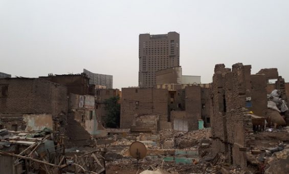
In this brief, we map some of Cairo’s richest and poorest neighborhoods focusing on just how close the rich and the poor live to one another. We draw attention to the spatial inequality of the city. Spatial inequality “emphasizes the structural-territorial bases of inequality, extending […] concern with stratification to the new frontier of geographic space” (Lobao and Saenz 2002, 499). Spatial inequality increases as poverty, low-quality services, and infrastructure became concentrated and embedded in specific geographic areas. Moving down to the neighborhood level allows us to identify areas where the lived experience of inequality is very prescient, where inequality is highly visible in both the data and the dilapidated houses which stand in contrast to their more prosperous surroundings and five-star luxury hotels.
The Level of Analysis Problem in Studying Inequality
For a long time, most studies of inequality focused on macro (country-level) analyses. Such macroeconomic indicators indicate that income inequality is lower in Egypt than in most other countries inside and outside the region. Verme et al (2014) argue that neither inequality nor poverty are worse in Egypt than many other places, relying largely on national-level poverty statistics and GINI coefficients. The GINI coefficient is the most typical measure of inequality and it ranges from 0 to 1, with lower numbers indicating greater equality. From 2005-2009, Egypt’s Gini coefficient hovered between .33 and .35, approximately on par with Organization for Economic Co-operation and Development (OECD) countries (Verme et al 2014, 38). In November 2013, the Gini coefficient dropped to .30, the lowest ever estimated in Egypt (Verme et al 2014, 2). Approximately 60% of the global community has higher GINI scores than Egypt and are therefore more unequal societies. Inequality typically decreases the wealthier a country becomes and the GINI in Egypt is already lower than expected given its income. In terms of the global income distribution, the poorest Egyptians—the bottom 1%– are better off than 15% of the rest of world. They are “not as destitute as [the poorest] in India, China, and Brazil” (Verme et al 2014, 40).
Yet, these statistics showing low levels of inequality do not match the perceptions of average Egyptians. Many individuals feel inequality is high and Data from the Arab Barometer (Tessler et al., Wave 3, 2012-2014) showed that 88% of respondents believed the economic situation—poverty, unemployment, and price increases—to be the most important challenge Egypt was facing. In 2013, more than 90% of citizens rated the economic situation as “bad” or “very bad,” an increase from 2011 when 76% did. Most respondents (55%) cited the betterment of economic situation as the main reason for the Arab Spring protests and there is not much optimism that conditions will improve: 57% of respondents said that the economic situation will worsen in the next few years compared to the current situation. The level of economic inequality is intrinsically linked to how Egyptians understand democracy: About one-third of respondents believed narrowing the gap between the rich and the poor to be the most important characteristic of democracy and only 9% believed the government was doing a good job at it.
Inequality is inherently a referential concept, one that requires comparisons between groups. For example, the fact that the poorest in Egypt “are still better off” than the world’s most destitute does not mean that they do not experience economic insecurity or have concerns about inequality. As Verme et al (2014) note, the poorest Americans are better off than 55% of the global population; however, inequality in United States is still viewed as a major issue, impacting American politics and elections to a high degree, and a major concern for many people who experience inequality in their day-to-day lives. It is unlikely that the global stage is the reference point for most individuals: most people do not look at their own economic situation, compare themselves to how individuals the world-over are doing, and then form their opinions about inequality. People also do not typically use the country as a whole for their reference group: people’s perceptions of inequality are primarily shaped by their immediate environment (Hauser and Norton 2017). Thus, it is necessary to “scale down” to the subnational level to understand how people experience inequality.
Once we scale down, not only can we have a more accurate view of the inequalities people see in their daily lives, but the shortcomings of macro-level analyses become very apparent. Primarily, national-level GINI coefficients homogenize differences across geographic space. Although rural areas tend to suffer from higher poverty rates, interpersonal inequality tends to be highest in urban areas. More localized analysis of urban areas may offer clues to the paradox of “declining inequality” but “rising political unrest” which Egypt has experienced in the last decade, particularly embodied by the Arab Spring in 2011.
We know that within Egypt, inequality is highest in Cairo and worsened in the years leading up to the Arab Spring. From 2005 to 2009, the average income in Cairo dropped by 14% (Milanovic 2014, 48). By November 2009, the GINI coefficient in Cairo was 39.7—the highest level of inequality of any governorate in the country (Milanovic, 2014, 50). In addition, data show a decrease in per capita household expenditures on food, non-food items, housing and durables (Verme et al 2014, 38). Life had become more expensive for many people and these figures suggest that they had reduced their consumption.
But scaling down to the city-level can only tell us so much. For example, what a city-level GINI coefficient measures is the amount of inequality between individuals or more typically households (depending on the level of analysis of the survey) located anywhere within the city limits. It does not tell us where these households are, whether the rich and the poor reside in the same parts of the city or are spread very far apart, or anything else about the geography of poverty, wealth, and inequality. Two different cities could have the same GINI coefficient and yet could display very different spatial patterns of inequality. For example, in one city the rich and poor might be evenly distributed, living together in mixed-income neighborhoods, while in the other, the rich and the poor may reside on the opposite ends of the city. One city might have isolated pockets of poor areas surrounded by wealthy neighbors, while in another, wealth is concentrated in one specific section. In other words, Cairo’s GINI coefficient only tells us that inequality is relatively high within the city as a whole. It cannot tell us how inequality manifests across space.
Therefore, we shift attention to the lowest subnational level of analysis, the shiyākha, or neighborhood to examine the intersection of inequality and geography. This allows us to identify how neighborhood adjacency and proximity might explain popular perceptions of inequality and their accuracy. In this brief, we utilize mapping tools to identify where the rich and poor live side-by-side to illustrate that the immediate environment reveals stark inequalities. We then profile pairs of adjacent neighborhoods which are very different from one another economically. We do this to challenge accounts which posit that inequality in Egypt is minimal at best. Such accounts dismiss the lived experiences of residents living in highly unequal areas, who know very well that their neighborhoods are unequal. With visible inequality, they can see so very clearly.
An important caveat is this analysis rests on the most recent available Egyptian CAPMAS census (2006), and we hope some of the conclusions may be updated as soon as the 2017 census becomes publicly available. The additional data will also allow an analysis of change over time, which will help us trace how economic growth in recent years, coupled with increasing poverty rates and inflation, affected individual neighborhoods.
The Distribution of Per Capita, Poverty Line and Poverty Gap Across Neighborhoods in the GCR
There are major differences between neighborhoods in the GCR when it comes to per capita income, a measure of wealth, and the percentage of residents below the poverty line. Though these are highly correlated, they are not identical. A neighborhood could have a low percentage of residents below the poverty line, but only a moderate per capita income. This would be the case if many people are living on the cusp of poverty but not quite below the poverty line. So, when we compare neighborhoods, we must look at both per capita income and poverty rates. It is also necessary to consider the poverty gap, which is a measure of the depth of poverty. The “gap” refers to the distance between the average income in the area–in this case, the neighborhood–and the poverty line. For example, the poverty line in Egypt is currently LE 800 (USD 44.72) per person, per month.[1] For a neighborhood with a poverty gap of 5%, an average increase of LE 40 per individual per month would bring the per capita income of the neighborhood up to the poverty line (40 is 5 percent of 800). The largest poverty gap in our dataset is 36%, meaning that an average increase of LE 240 per individual per month would be necessary to lift the neighborhood out of poverty. Like the relationship between per capita income and poverty rates, two neighborhoods may have the same percentage of residents living below the poverty line, but in one neighborhood, residents are just below the poverty line, while in another, they are very far below it. Thus, each of these three variables are important for identifying adjacent neighborhoods that are highly unequal on these dimensions.
The three graphs below show the distribution of per capita incomes (Figure 1), poverty rates (Figure 2) and the poverty gap (Figure 3), across all neighborhoods in the GCR. This illustrates that there is a large amount of variation in the data, providing some initial evidence of the high levels of inequality within the city.
In Figure 1, we see that the distribution of per capita incomes is highly skewed. The lowest annual per capita income across neighborhoods is LE 2,570,[2] while the highest is LE 20,817.[3] Seventy-five percent of neighborhoods have per capita incomes of less than LE 6,367,[4] while there are 83 neighborhoods which are upper-end outliers with per capita incomes above LE 8,360.[5] Some neighborhoods are much wealthier, which we can see as we move further to the right of the graph. The extreme outliers are those that are above LE 10,000,[6] with some neighborhoods possessing per capita incomes that are more than double this amount. What this graph tells us is that a fairly small number of neighborhoods hold a disproportionate amount of the wealth, an indication of inequality in per capita incomes.
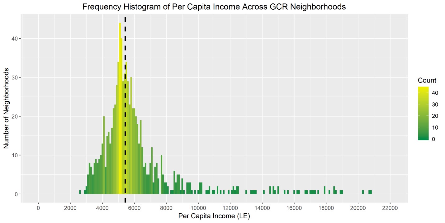
Figure 1: Frequency Histogram Showing the Distribution of Per Capita Incomes Across Neighborhoods in the GCR. The highest frequency (most common) per capita incomes are shown in yellow, while the lowest frequency values appear in dark green. The black dotted line represents the median annual per capita income, which is LE 5,433.
Figure 2 shows neighborhood poverty rates, as measured by the percentage of residents living below the poverty line. Poverty also varies dramatically across the GCR: from .26% to 91.5% of neighborhood residents living below the poverty line. While the median hovers around 21%, meaning that half of the neighborhoods in the GCR have poverty rates below this level, this distribution is also skewed. Sixty neighborhoods are outliers, with poverty rates above 58%, and a few extreme outliers have poverty rates above 85%.
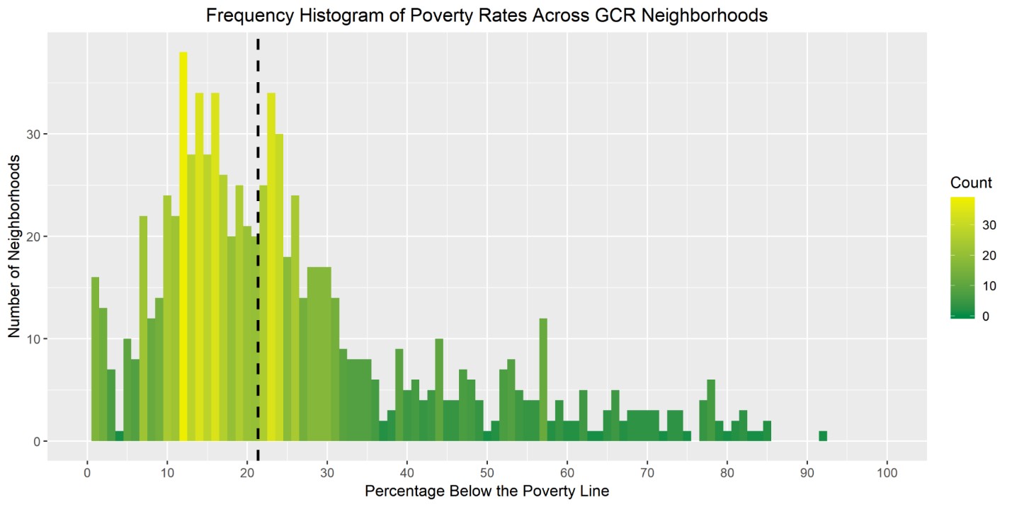
Figure 2: Frequency Histogram Showing the Distribution of Poverty Rates Across Neighborhoods in the GCR. The highest frequency (most common) poverty rates are shown in yellow, while the lowest frequency values appear in dark green. The black dotted line represents the median poverty rate, which is 21.35%.
As mentioned, our data comes from the most recent available census (2006), so the information that we have about neighborhood poverty rates is based on the poverty line at the time of data collection. In 2006, the lower poverty line in Egypt was LE 1,423 annually per capita, or about LE 118 per month (World Bank 2007). The lower poverty line is an estimate of the minimum level of food and non-food expenditures necessary for survival. The upper poverty line, a more generous measure of poverty, stood at LE 1,853 (LE 154 per month).[1] The poverty line has risen consistently in recent years: from LE 297 a month in 2010 (Ahram Online, 2013) to LE 326 in 2012 (Unicef, 2015) to LE 482 in 2015 (Egypt Independent, 2016). The most recent increase to LE 800 is largely a product of the devaluation of the Egyptian pound, which saw a 50% decrease in its value when the Egyptian government floated the pound in November 2016 (Egypt Today 2017). What the current poverty line tells us is that Egyptians now need $1.47 per day (about LE 26) to meet their most basic needs. In 2006, this value was $0.67 (using the currency exchange rate for that year), and just before the Arab Spring in 2010, that number had risen to $1.70. To compare, the international poverty line is $1.90 per day, which equals about LE 40 per day or LE 1,200 per month (World Bank 2015). Recently, the World Bank introduced a new metric to better estimate poverty in middle-income countries. For lower middle countries like Egypt, the World Bank estimates $3.20 per day is closer to the reality of what is necessary for survival (Ferreira & Sanchez 2017). What this tells us is that the 2006 census data, which already paints a bleak picture for certain neighborhoods, does not begin to capture the extent of poverty that Cairenes experience today.
Figure 3 shows the poverty gap, a measure of the depth of poverty, which ranges from .02% to 36.6%. What this means is that in the neighborhood with the highest poverty gap, residents are on average 36.6 percentage points below the poverty line. For most neighborhoods, the depth of poverty is not this extreme. The median poverty gap is 3.67%, and seventy-five percent of neighborhoods have a poverty gap of less than 6.7%. Overall, most of the poor in the GCR live right below the cusp of the poverty line. However, this is not true in all neighborhoods. There are 41 outliers, where the poverty gap is greater than 13% and several extreme outliers, where the depth of poverty is above 20%. What is particularly troubling, however, is that in neighborhoods where poverty rates are high, the depth of poverty also tends to be extreme.
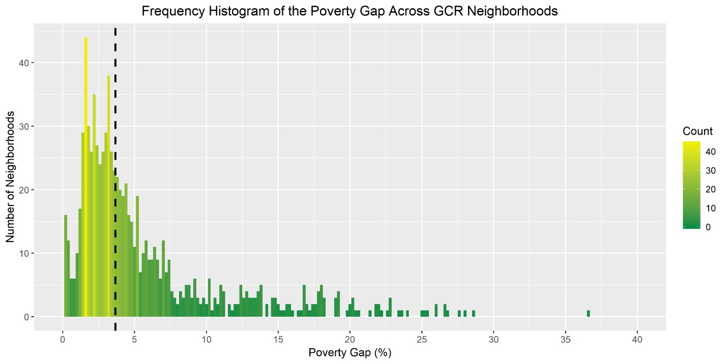
Figure 3: Frequency Histogram Showing the Distribution of Poverty Rates Across Neighborhoods in the GCR. The highest frequency (most common) poverty gaps are colored in yellow, while the lowest frequency values appear in dark green. The black dotted line represents the median poverty gap, which is 3.67%.
Figure 4 plots the correlation between poverty rates and the poverty gap. The neighborhood with the highest poverty rate, where 95.5% of residents live below the poverty line, also has the highest poverty gap compared to all other neighborhoods in the GCR (36.6%). The neighborhoods which are outliers when it comes to poverty rates (above 58%) also tend to be outliers on the poverty gap (above 13%). The red X’s in Figure 4 represent neighborhoods that are outliers in both respects. So, although the poverty gap is relatively low for most neighborhoods in the GCR, some neighborhoods are “doubly disadvantaged,” with both high poverty rates and deep levels of poverty, with many residents living far below the poverty line.
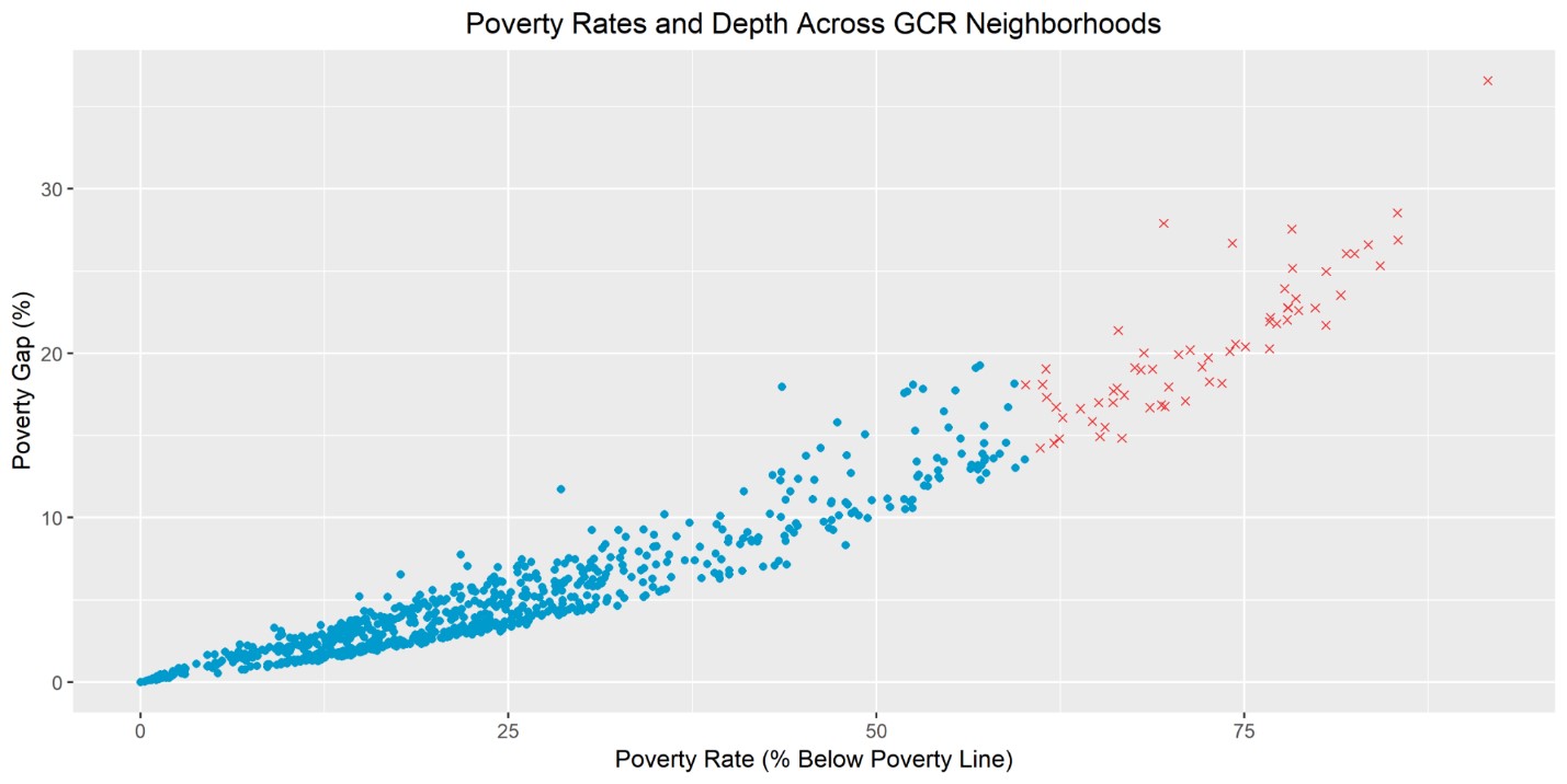
Figure 4: Scatterplot Comparing the Poverty Rate and the Depth of Poverty (the Poverty Gap) Across GCR Neighborhoods. The points shown in red are neighborhoods that are outliers for both their poverty rate (above 58%) and their poverty gap (above 13%). Meanwhile, some neighborhoods have poverty rates that are near zero along with a near zero poverty gap.
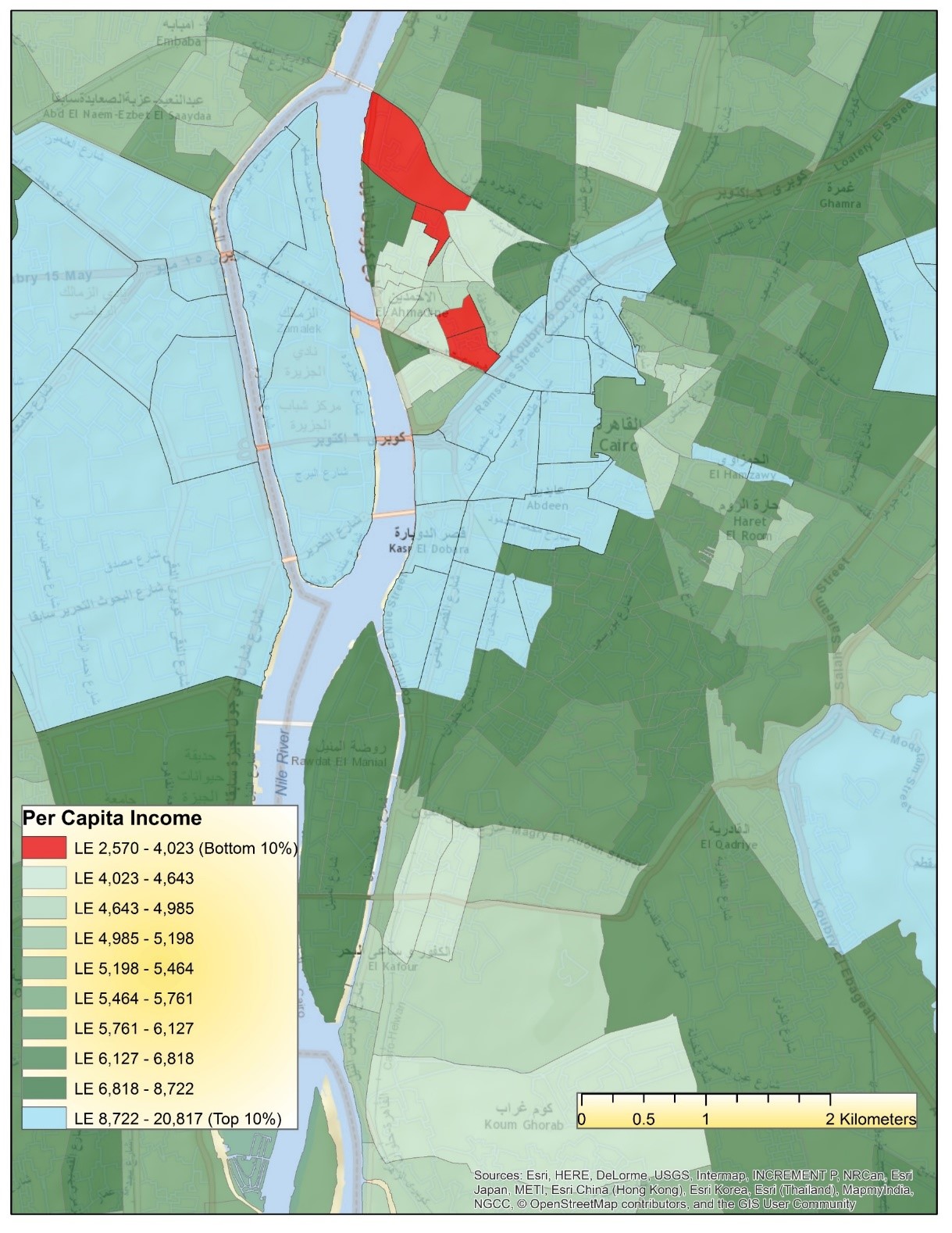
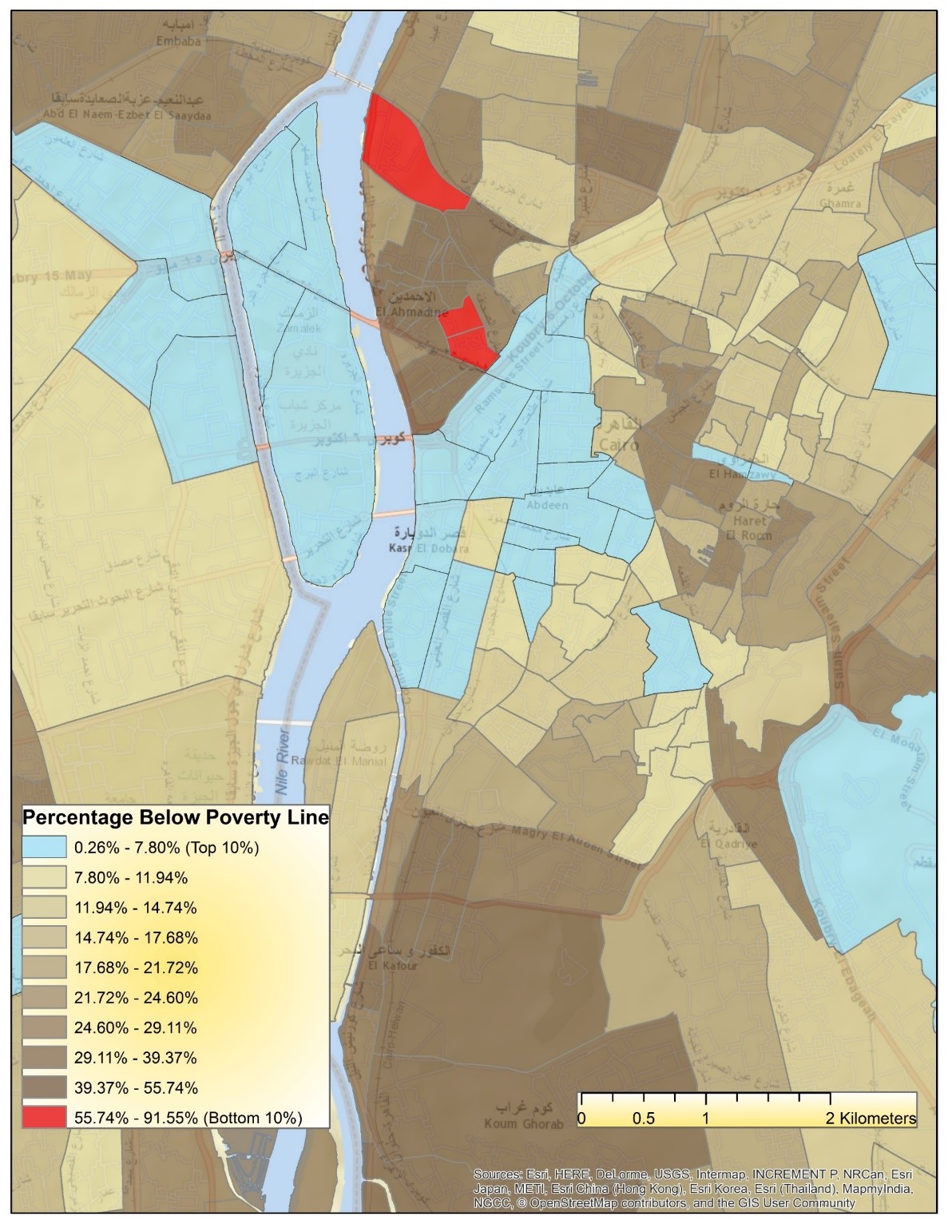
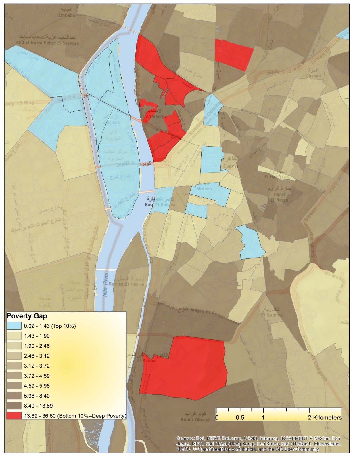
The distribution of wealth, poverty and the depth of poverty also follow a spatial distribution. In the maps below, neighborhoods in blue represent those that are the most prosperous relative to others, with the highest per capita incomes (Map 1), lowest poverty rates (Map 2) and the lowest poverty gap (Map 3). Meanwhile, the red neighborhoods are the most disadvantaged on these indicators.
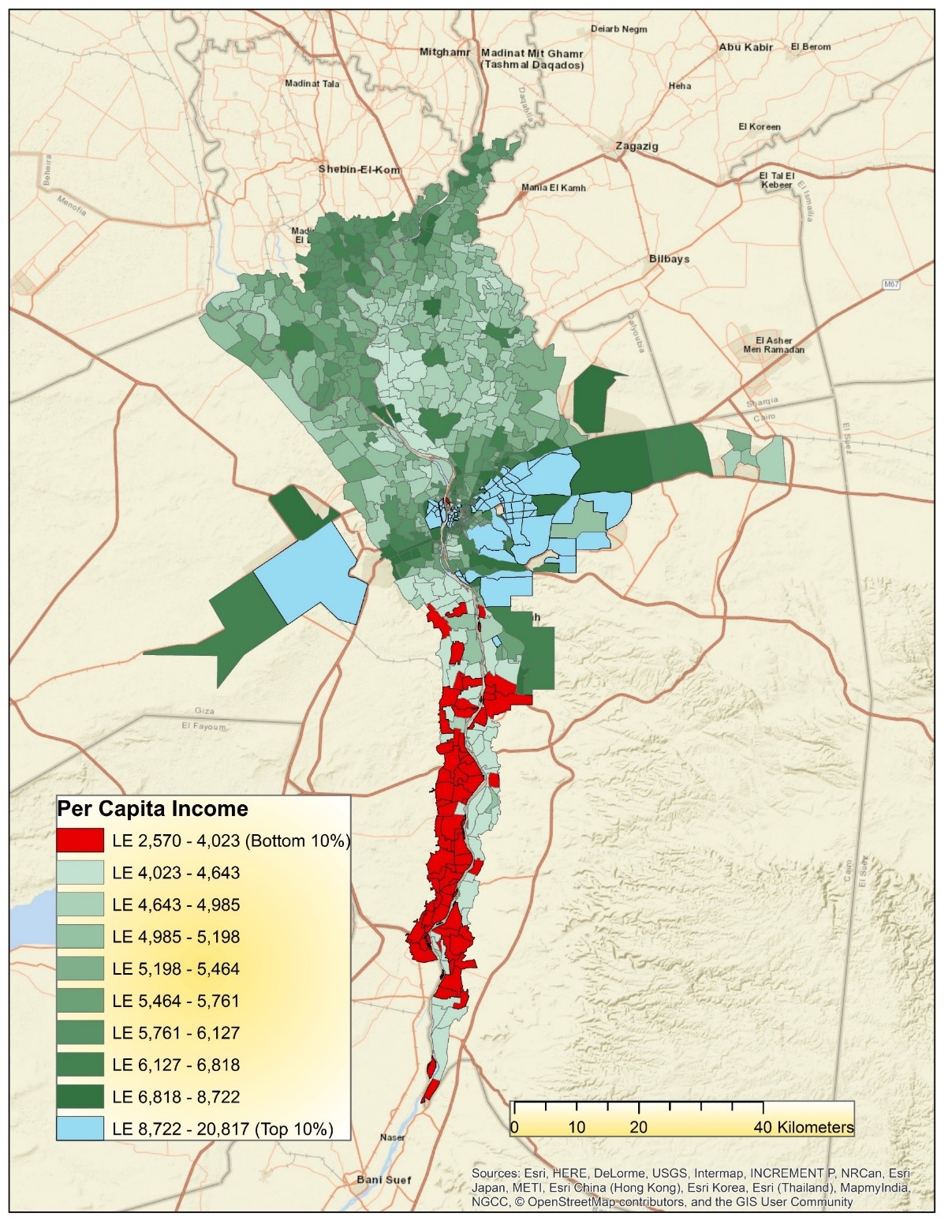
Map 1: Spatial Distribution of Wealth (Measured as Per Capita Income) Across GCR Neighborhoods. The top 10% are the neighborhoods which are the most prosperous relative to others, while the bottom 10% are the least well-off.
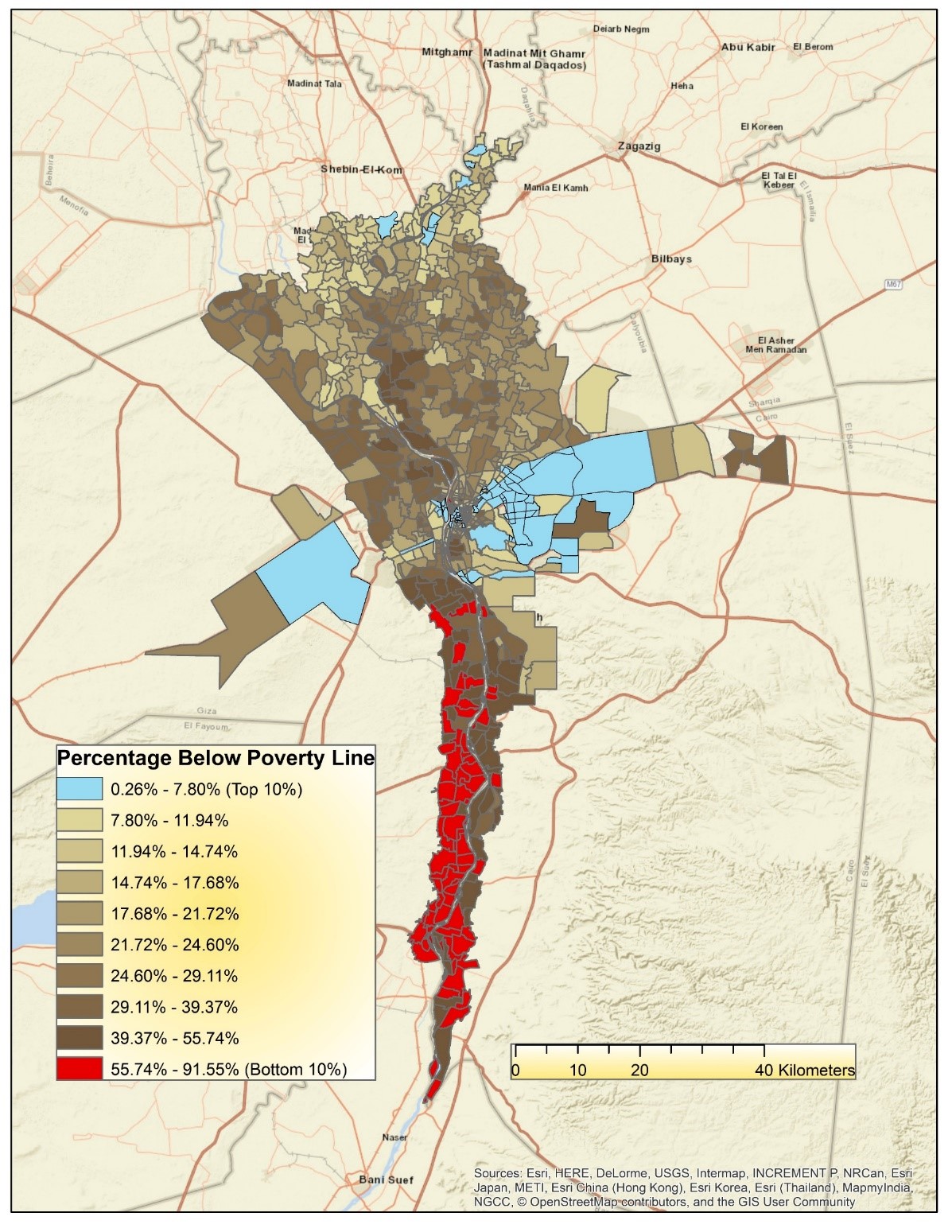
Map 2: Spatial Distribution of Poverty (Measured as the Percentage of Residents Below the Poverty Line). The top 10% refers to the neighborhoods with the lowest poverty rates—those that are the best off relative to others. The bottom 10% refers to the neighborhoods where poverty rates are the highest.
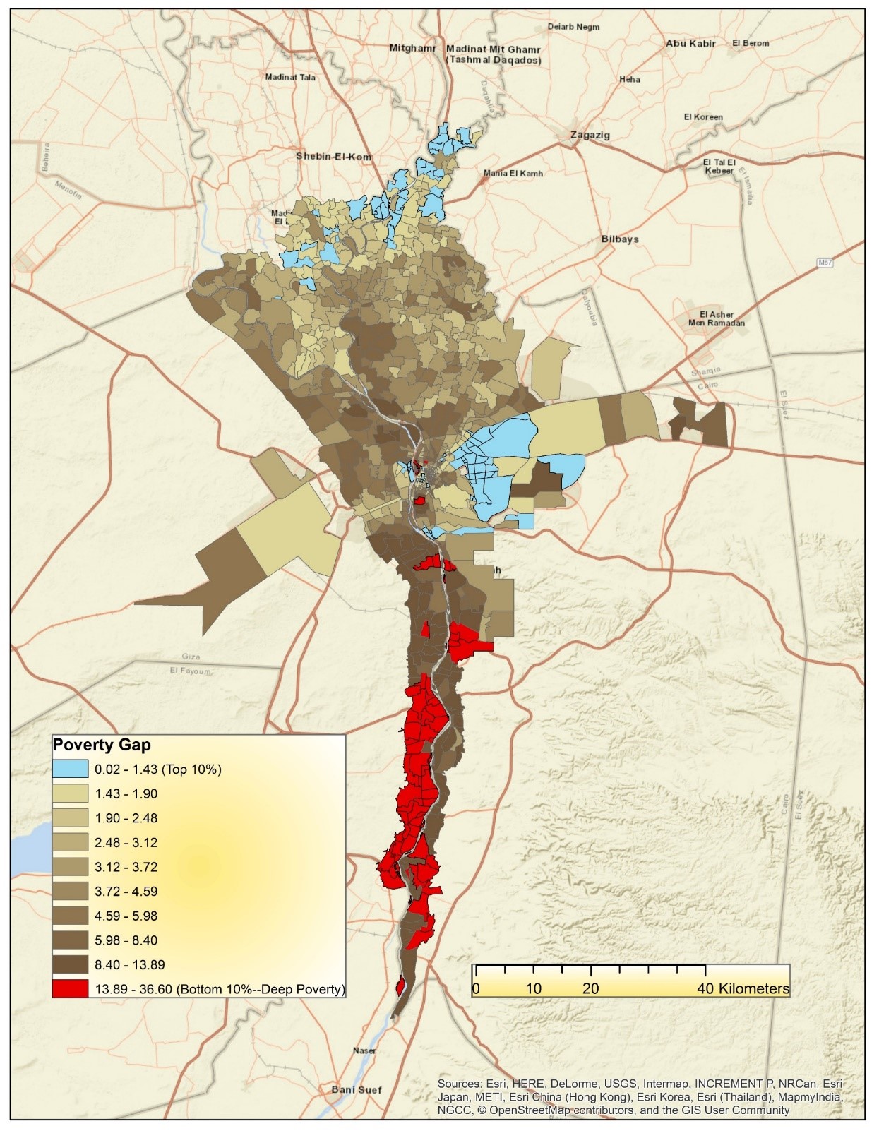
Map 3: Spatial Distribution of the Depth of Poverty (as Measured by the Poverty Gap). Those in the bottom 10% (red) suffer from the deepest levels of poverty, with the poor living far below the poverty line. The neighborhoods in the top 10% (blue) have the smallest poverty gaps. In these neighborhoods, the poor live just below the poverty line.
Overall, we see an urban-rural split, where the most advantaged neighborhoods are in Cairo proper or in the northern urban centers, while the most disadvantaged neighborhoods are in the peripheral, much more rural areas of the GCR. However, if we look closely at the city center, we can see that there are red areas very close to much wealthier counterparts. Maps 4, 5, and 6 are identical to those above but zoom into the heart of Cairo to get a closer look at these areas.
These three maps display a very small area: the scale bar on the bottom of each map gives a sense of how close together these neighborhoods are. The amount of variation in such a small geographic space highlights our main point that moving down to a smaller-scale gives a very different picture of inequality. Neighborhoods in the top 10% are very close to those in the bottom 10%. When the rich and poor live in such close proximity, it is not surprising that perceptions of inequality would be high. These data show that these perceptions are quite accurate; the facts align with perceptions, contrary to arguments which suggest that inequality is low and therefore these perceptions are flawed.
On each of these three maps, two pairs of adjacent neighborhoods stand out, with stark differences between them in wealth, poverty and the poverty gap. We turn now to these pairings.
Al-Qālaya & Orabi – Al-Tawfiqiyya
The first pair of neighborhoods are al-Qālaya (red in Map 7, below) and Orabi – Al -Tawfiqiyya (blue in Map 7). Al-Qālaya is located in Qism Būlāq (Būlāq District) and is home to 3,164 residents, while Orabi- al -Tawfiqiyya is in Qism al-Azbakiyya and has a population of 2,826. Their populations are roughly equal, which is good for comparison, and on nearly every dimension, Orabi – al -Tawfiqiyya is more prosperous than its neighbor al-Qālaya.
Map 7 shows these two neighborhoods in relation to one another. Beyond illustrating that these disparate neighborhoods are adjacent to one another, we can think of the image as an asset map, as it shows a snapshot of some of the resources available in each neighborhood. Typically, asset mapping is a participatory community development process, a process of “identifying, supporting, and mobilizing existing community resources and capacities for the purpose of creating and achieving a shared vision of change” (Sharpe et al., 2000, 206). However, we can draw upon the concept to illustrate the differences between these communities when it comes to health services, businesses, transportation, and institutions. As we can see in the map, Orabi – al -Tawfiqiyya has restaurants and cafes, shopping malls, cinemas, a couple of syndicate headquarters, two metro stops, health clinics, and several banks. Meanwhile, al-Galāʾ hospital is in al-Qalāya, as well as an electrical distribution company, but there is little else.
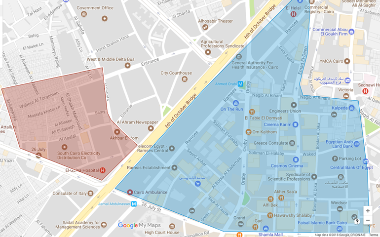
Map 7: The Assets of Al-Qalāya (red) versus Orabi – Al -Tawfiqiyya (blue).
Map Data: © 2018 Google, ORION-ME
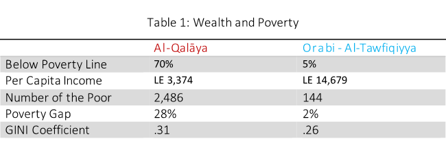
Because these neighborhoods are next to one another, the assets of Orabi – al -Tawfiqiyya are theoretically accessible to residents of al-Qalāya. However, as our census data shows, it does not appear that the assets of the more prosperous neighborhood cross neighborhood boundaries to create wealth in al-Qalāya. The tables below compare these neighborhoods on wealth and poverty metrics, household assets, education and the labor market. The wealth, poverty and depth of poverty variables—which we used to identify these areas in the first place—reveal stark differences in the social and economic conditions of these neighborhoods (Table 1). Orabi – al-Tawfiqiyya’s per capita income is LE 11,305 more than al-Qalāya. Its poverty rate is 65 percentage points lower than al-Qalāya. Al-Qalāya suffers from extreme poverty, with a poverty gap of 28%, while the very few poor residents of Orabi – al Tawfiqiyya—only 144—are classified as poor. The very low poverty gap of 2% tells us that these residents live just below the poverty line.
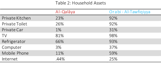
Unsurprisingly, these measures spill over into household assets (Table 2). Within this category, the two neighborhoods differ the most regarding access to a private kitchen and private toilet (nearly 100% of households have these in Orabi – al Tawfiqiyya, while only about a quarter do in al-Qalāya). There are also big differences in access to private cars, and technology, such as mobile phones, computers, and the internet. Household assets capture more than just wealth. For example, access to a private car is really a question of mobility, while technology provides greater access to information. When household assets differ on these metrics, it may limit certain opportunities, such as jobs or education.
When it comes to education (Table 3), very few residents have a university degree in al-Qalāya (only 5% of men and 4% of women), and illiteracy rates are astronomically high (44% of men and 51% of women are illiterate). Meanwhile, almost half the residents of Orabi – al -Tawfiqiyya have a university degree, and the illiteracy rate is comparatively low, at 8% and 11% for men and women respectively. If these differing education rates have an impact on employment, it is only a modest one. Unemployment rates amongst men and women are both slightly lower in Orabi – al -Tawfiqiyya than al-Qalāya, differing by only a few percentage points (Table 4).
Although employment rates are roughly equal between these neighborhoods, we do not have a measure of the quality of jobs. We can infer that higher incomes, greater household assets, and higher education rates in Orabi – al -Tawfiqiyya likely mean that residents there have decent jobs, which are increasingly rare in Egypt after the period of neoliberal reforms and the rise of temporary contracts. The ILO defines decent work as employment that is “productive and delivers a fair income, security in the workplace and social protection for families, better prospects for personal development and social integration, freedom for people to express their concerns, organize and participate in the decisions that affect their lives and equality of opportunity and treatment for all women and men” (n.d.). More than likely, the jobs residents hold in al-Qalāya provide little security, few benefits and not much chance for upward mobility.
Sharkas & Maʿrūf
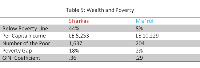
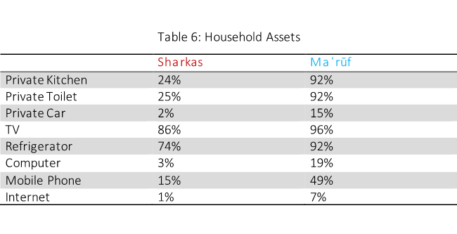
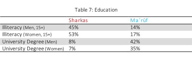
The next two neighborhoods which stand out in our mapping are directly south of the first pair. The conditions in Sharkas versus Maʿrūf parallel the differences between al-Qalāya and Orabi – al-Tawfiqiyya. Like al-Qalāya, Sharkas is also located in Qism Būlāq. Maʿrūf is in Qasr Al Nil. The tables below compare these neighborhoods on the same variables as above. Although the disparities are slightly less extreme in this pairing, the conclusions that we can draw are largely the same: the quality of life and the opportunities available in Maʿrūf far outweigh those of its neighbor, Sharkas.
What is unique about Sharkas is that it is located within the Maspero Triangle (red, in Map 8 below), an informal area which occupies prime real estate, surrounded by some of downtown Cairo’s most important cultural and commercial sites. Two other neighborhoods make up the Maspero Triangle; however, we focus on Sharkas because it is immediately adjacent to Maʿrūf (blue in Map 8). However, all three neighborhoods suffer from high levels of poverty, standing out in our maps particularly when it comes to the poverty gap.
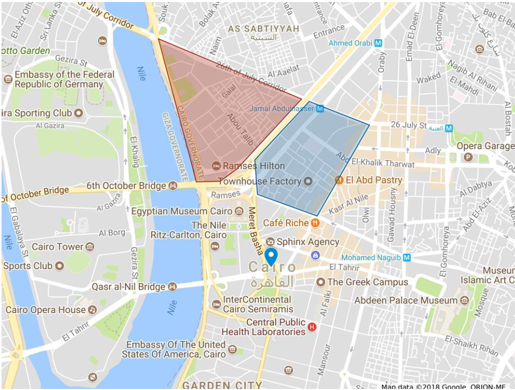
Map 8: The Maspero Triangle (red) and Maʿrūf (blue), in relation to Tahrir Square and Other Cultural & Commercial Sites. Map Data: © 2018 Google, ORION-ME
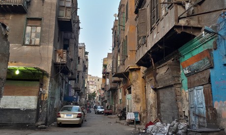
The Maspero Triangle borders the Nile, and is just north of Tahrir Square, the Egyptian Museum and the Ritz Carlton. In neighboring Maʿrūf (blue in Map 8), middle-class residents generate income from car repair shops, a common enterprise in the area, which sit next to historic houses and contemporary art spaces. The historic Ṭalaʿt Ḥarb street demarcates the eastern border of Maʿrūf, with its neoclassical and Art Deco architecture, including the Yacoubian building at the very corner of the neighborhood. And within the Maspero Triangle itself, on the westernmost side bordering the Nile, is the Ramses Hilton, the Egyptian Radio and Television headquarters and the Foreign Affairs ministry. The Maspero Triangle and its surroundings are perhaps the best example of visible inequality in Cairo, where dilapidated houses are juxtaposed against attractions that are popular for tourists, as well as sites that house important government offices.
Given that the area surrounding the triangle contains many tourist sites, comparing hotel prices in the area with the incomes of the residents there is another way of looking at inequality (Map 9). While residents of Sharkas subsist on an average annual income of LE 5,253 per person (about USD 294),[1] the average price for a hotel room in neighboring Maʿrūf is around LE 359 per night (USD 20). Compare this to the current poverty line of LE 800 per month (USD 44). Or one could stay at the Ramses Hilton, located within the Maspero Triangle, for LE 2,421 per night (USD 135), or the Ritz Carlton, just south of the area, for LE 8,248 (USD 460). As we noted in the asset mapping of Orabi – al -Tawfiqiyya and al-Qalāya, wealth doesn’t cross neighborhood boundaries or trickle down into the hands of residents of poor neighborhoods; despite the proximity of the residents of Sharkas and the larger Maspero Triangle to so many income generating sites, economic conditions remain dire in these neighborhoods.
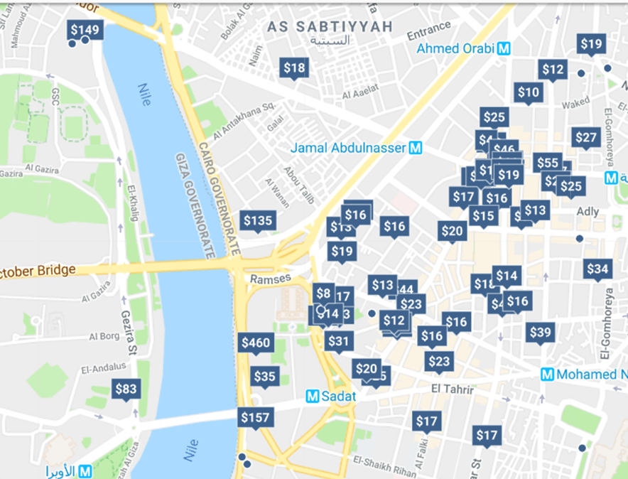
Map 9: Hotel Prices in the areas surrounding Sharkas and the Maspero Triangle. Price estimate for June 18th, 2018. Map Data: © 2018 Google, ORION-ME
It is unsurprising then that the Egyptian government identified the Maspero Triangle as a target for redevelopment. Though conflicts over property, renovating older housing, and tenure rights have been ongoing since the 1970s, they intensified after the establishment of the Informal Settlements Development Facility (ISDF) in 2008 (Shawkat & Khalil 2015). The ISDF was formed after the Duweiqa rock fall killed more than 100 people living in an informal settlement under the Muqattam cliffs. Its mandate is to review and categorize informal areas; those that are designated as “unsafe” are graded on a four-point scale to determine intervention strategies. Depending on how severe the ISDF deems the threat to be, government responses range from negotiations with residents to regularize tenure to upgrading buildings and public services to rehousing and resettlement. Although there is truth in the claim that structural issues with some of the Triangle’s houses pose safety risks, there are major financial incentives for the government to redevelop informal areas on high-value land such as the Maspero Triangle, and to employ more aggressive interventionist approaches such as forced evictions (Tadamun 2014).
When the ISDF designated Maspero as unsafe, the government issued a series of demolition orders, and many residents were forcibly evicted that year (Shawkat & Khalil 2015). In response, residents formed associations to resist the evictions and redevelopment of the area, and initially, it appeared that the government was willing to engage in a participatory process with the community (Khalil 2018). As it became clearer that the government would not implement the community’s plans, and speculators started to buy more land while the government refused to issue permits for residents to repair existing homes, protests erupted in both 2011 and 2013 (Shawkat & Khalil 2015).
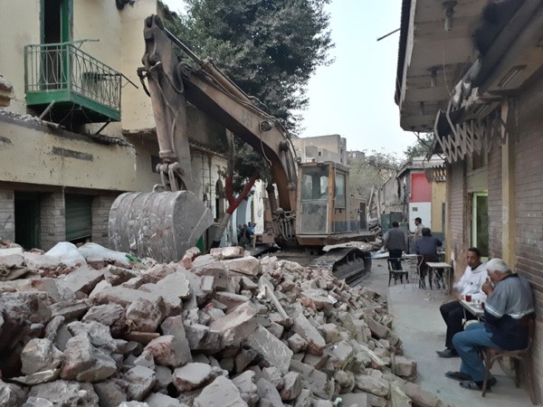
The Egyptian Center for Civil and Legislative Reform (ECCLR) worked with Madd, a group of architects and engineers, to develop a plan to upgrade the area while avoiding forced eviction, relocation or demolition (Khalil 2018). Instead, in 2015 the Egyptian Ministry of State for Urban Renewal and Informal Settlements (MURIS) awarded British architecture firm Foster + Partners the contract to redevelop and redesign the Maspero Triangle. Foster + Partners claim that the plan “allows the existing population of the district to maintain their overlapping spatial live-work relationships” alongside new office and retail spaces, and perhaps the firm had the intention to do so. Yet the firm’s renderings of the project (Images 1 and 2 below) erase the cultural fabric of the neighborhood, presenting only a sanitized version of Maspero’s winding streets. In June 2016 the Ministry of Housing changed the rents of the new units that it claimed would be available for the displaced community upon the project’s completion, making it unaffordable for most families to stay in Maspero (Khalil 2018). By March of 2018, only 850 of a total of 4,500 households had decided to return after the redevelopment, but many had not yet received their temporary housing allowance to relocate (Al Tawy 2018). The demolition of the neighborhood took place in late April 2018.
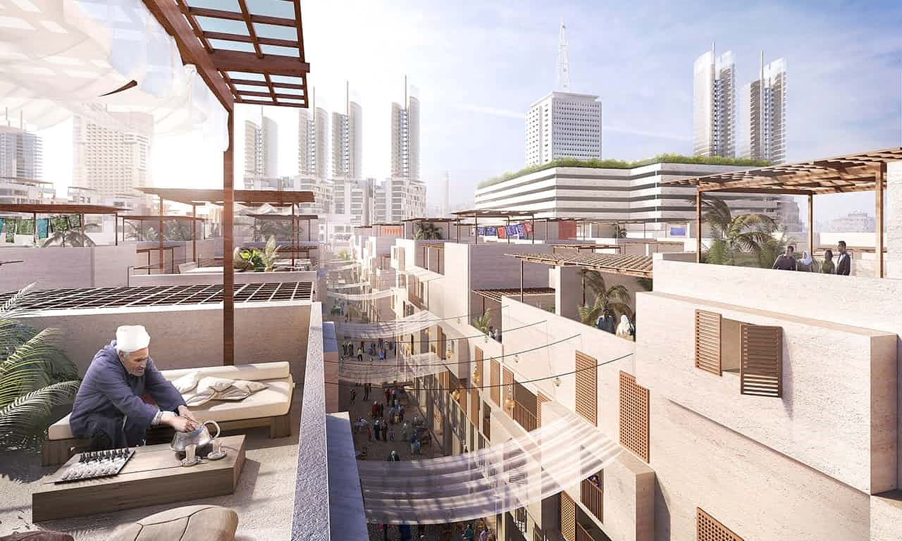
Image 1: Rendering of the Maspero Redevelopment Plan, Foster + Partners. Image Source: The Cairo Observer
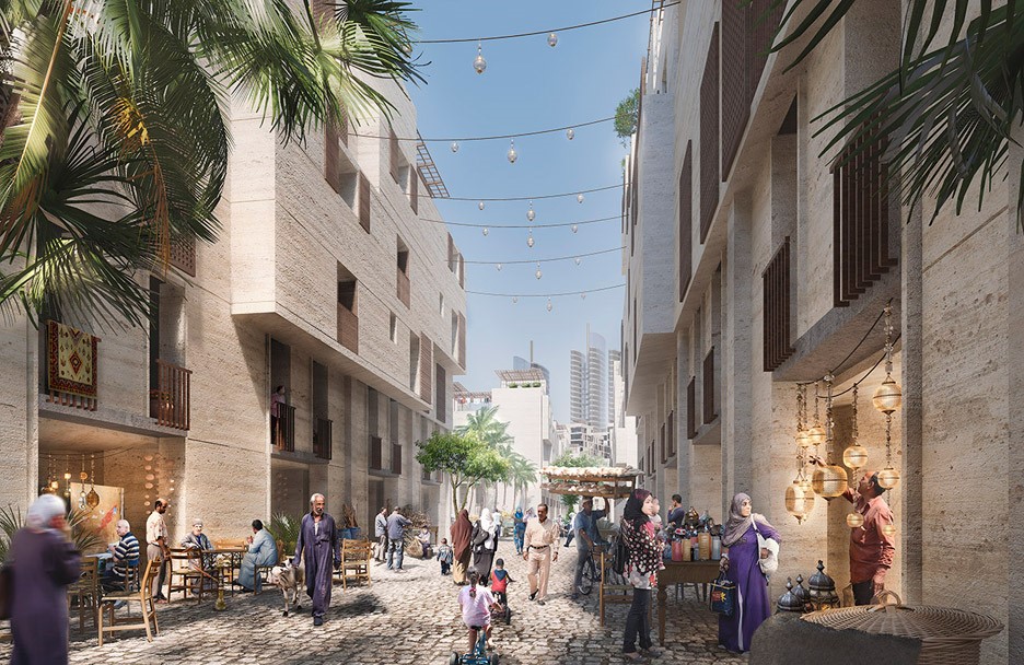
Image 2: Rendering of the Maspero Redevelopment Plan, Foster + Partners. Image Source: The Cairo Observer
The Maspero Triangle and its demolition is a visceral example of visible inequality as well as its erasure. The inequality was highly visible to residents, but also to the government. As is the case with many informal areas, the government treated the area as a problem to be removed, to transform the area into more valuable real estate property, including a vehicle to attract foreign investment. The decision of the government to forcibly evict residents from Maspero and demolish the area might eliminate the visible inequality of adjacent areas, but it simply relocates poverty and does not provide a solution.
Prior to the demolition, the Maspero Triangle could not be more disparate from its surroundings. At the beginning of this brief, we discussed how people form their perceptions of inequality based on their immediate environment. The “mismatch” between the fact of declining inequality at the national level and the perceptions ordinary Egyptians does not remotely hold at this level of analysis. The facts are that inequality is highly visible and people shape their understanding of their city and nation around these facts.
It is unsurprising then that Būlāq, the district that contains both of the disadvantaged neighborhoods we have highlighted in this brief, was a major site of contention during the Arab Spring protests. Although many accounts paint the revolution as being driven by social media wielding, educated, middle-class young people, Ismail brings the back streets of Tahrir back into the narrative (2013). There, protesters burned police stations, allowing the protests in the Square to continue with reduced police interference. The burning of police stations carried an important symbolism, representing “sites of violent government torture, verbal abuse, and humiliation” and the uprisings opened an opportunity for residents to settle the score (Ismail 2013, 872). Their proximity to Tahrir Square and preexisting conflicts with the state, along with the visible inequality residents experienced in their day-to-day lives, created the conditions for actors from these neighborhoods to become an important force in the Arab Spring protests and shaped their (yet unrealized) demands for equality and justice.
Targeting Investments and Overlapping Inequalities
It is important to note that in each of the pairings of neighborhoods we have discussed here, the disadvantaged and advantaged neighborhood are separated by district lines, an important administrative boundary in the allocation of certain budget funds. The budgeting process in Egypt is highly centralized, and little information is available about subnational budgets or precisely where the government makes investments. When the line ministries (such as the Ministry of Local Development, Health, Education or Housing) allocate funding to the subnational level, the Ministry of Finance mandates how they will use their budgets across governorates and districts. Local residents have no means of participating in these budgetary decisions, since even their weak local representative councils, or local people’s councils, have been disbanded since 2011.
No information is available about the distribution of any budgetary funds at the shiyākha level, but data on funding for local development projects is available for districts, the markaz level. This is one of the few line items of the Ministry of Local Development’s budget that is available and disaggregated at the local level. These funds finance projects such as lighting, street paving, and environmental upgrading. The two disadvantaged neighborhoods we have pointed out are both located in Būlāq, a district where 50% of the population lives below the poverty line, and yet, it received only LE 7 per person for local development projects in 2014/2015. Meanwhile, Qism al-Azbakiyya, which contains Orabi – al-Tawfiqiyya, the wealthiest neighborhood in this analysis, received LE 17 per person. In general, the richest districts receive the largest per capita share of local development funds. For example, the district of al-Nuzha, the wealthiest area in the city, received a far higher per capita allotment of local development funds than any other district in 2014/2015 (LE 42). Although this measure is limited, it demonstrates the disjuncture between local needs and the government’s distribution of resources and may serve as a proxy for other types of government investment.
Both our analysis of adjacent neighborhoods, and our general mapping which shows the large disparities between neighborhoods in wealth, poverty and the depth of poverty, highlight the need for better targeting of resources to the neighborhoods most in need. Our finding that adjacent neighborhoods are disparate on multiple measures and that the neighborhoods with the highest poverty rates also experience the deepest poverty illustrates the way in which inequality overlaps across multiple measures. Thus, not only is the spatial dimension of inequality important for better targeting of resources but a more holistic understanding of the challenges individual neighborhoods face, utilizing multiple metrics to include wealth, poverty, household assets, education and labor statistics, is also necessary to determine precisely what the needs are.
Scaling down to the local level, as well as focusing on adjacent areas, renders inequality much more visible than macro-level analyses. Many Cairenes know that their neighborhoods are unequal, and their perceptions are much more correct than what many scholarly analyses concede. Mapping data at this level can bring to the public eye what many Cairenes see so clearly in their day-to-day lives, and TADAMUN’s vision is that such data-driven research can serve as a tool for better targeting of public funds and effective public and private services for these neighborhoods.
———–
[1] Exchange rate for July 1, 2018. For the year of the income data (2006), LE 5,253 was about USD 920. Given that we know incomes dropped in Cairo in the years leading up to the 2011 Revolution, and poverty rates have continued to increase, it is unlikely that the average per capita income in Sharkas increased much from 2006. Even if incomes did rise, the devaluation in 2016 and the ensuing inflation would have surely cancelled out the positive effects of these increases.
[1] These figures are national level poverty lines; however, there are also regional estimates. For metropolitan areas, the lower poverty line in 2006 was LE 1,453 annually per capita and the upper bound was LE 1,921. For upper rural Egypt, the lower and upper bounds were LE 1408 to LE 1812, respectively. Note that the differences between these estimates is negligible, despite the much higher costs of living in urban areas. Research suggests that poverty lines in urban areas, and particularly within the GCR, are set too low to cover the true costs of necessities. Household surveys undercount those living in informal settlements, and the calculation of the poverty line does not account for the fact that many people living in informal areas pay more for these necessities (particularly food costs) than residents of more prosperous neighborhoods (Sabry 2010).
[1] Exchange rate as of July 1, 2018 where 1 USD = .056 LE.
[2] In Egypt, salaries are often denoted in monthly figures, but we have chosen to leave the census data as it is, as annual incomes, in order to help readers make comparisons to typical salaries in other country contexts.
[3] Translated into USD, this range is $143.82 to $1,164, utilizing the exchange rate for July 1, 2018. In 2006 dollars, the year of data collection, this range is $449 to $3,644 (exchange rate for last banking day of the year, December 29th, where 1 USD equaled .17507 LE). In November 2016, the Egyptian government floated the pound, decreasing its value by more than 50%.
[4] USD 356 (2018); USD 1,114 (2006)
[5] USD 467 (2018); USD 1,464 (2006)
[6] USD 559 (2018); USD 1,750 (2006)
References:
Adham, K. (2005). Globalization, neoliberalism, and new spaces of capital in Cairo. Traditional Dwellings and Settlements Review, 17(1), 19-32.
Ahram Online (2013, November 28). Egypt’s Poverty Rate rises to 26% in 2012/2013: CAPMAS. Retrieved from http://english.ahram.org.eg/NewsContent/3/12/87776/Business/Economy/Egypts-poverty-rate-rises-to–in–CAPMAS.aspx
Al Tawy, A. (2018, March 10). Residents of Cairo’s Maspero Triangle cling on as demolition looms. Ahram Online. http://english.ahram.org.eg/NewsContent/1/64/292339/Egypt/Politics-/Residents-of-Cairos-Maspero-Triangle-cling-on-as-d.aspx
Badawy, A., Abdel-Salam, H., & Ayad, H. (2015). Investigating the impact of urban planning policies on urban division in Cairo, Egypt: The case of El-Maadi and Dar El-Salam. Alexandria Engineering Journal, 54(4), 1225-1232.
Briggs, X. (2005). Social Capital and Segregation in the United States. In D. Varady Desegregating the City: Ghettos, Enclaves and Inequality. Albany: SUNY Press.
Briggs, X. (2007). Entrenched Poverty, Social Mixing and ‘the geography of opportunity’: Lessons for policy and unanswered questions. Georgetown Journal of Poverty Law and Policy 13(3):403-414.
Chaskin, R. J., & Joseph, M. L. (2010). Building “community” in mixed-income developments: Assumptions, approaches, and early experiences. Urban Affairs Review, 45(3), 299-335.
Egypt Today. (2016, July 27). 27.8 percent of Egyptian population lives below poverty line: CAPMAS. Retrieved from http://www.egyptindependent.com/278-percent-egyptian-population-lives-below-poverty-line-capmas/
Ferreira, F. & Sanchez, C. (2017). A richer array of international poverty lines. World Bank. Retrieved from http://blogs.worldbank.org/developmenttalk/richer-array-international-poverty-lines
Graham, C., Pinto, S. and Ruiz, J. (2015). Stress, worry, and social support: Inequality in America’s Cities. Social Mobility Memos, Brookings Institutions. Retrieved from https://www.brookings.edu/research/stress-worry-and-social-support-inequality-in-americas-cities/
Hauser, O. P., & Norton, M. I. (2017). (Mis)perceptions of inequality. Current Opinion in Psychology, 18, 21-25.
ILO (n.d.) Decent Work. Retrieved from http://www.ilo.org/global/topics/decent-work/lang–en/index.htm
Ismail, S. (2013). Urban subalterns in the Arab revolutions: Cairo and Damascus in comparative perspective. Comparative Studies in Society and History, 55(4), 865-894.
Khalil, O. (2018, June 4). From community participation to forced eviction in the Maspero Triangle. The Tahrir Institute for Middle East Policy. Retrieved from https://timep.org/commentary/from-community-participation-to-forced-eviction-in-the-maspero-triangle/
Lobao, L., and Saenz, R. (2002). Spatial inequality and diversity as an emerging research area. Rural Sociology 67(4), 497–511.
Milanovic, B. (2014). Spatial Inequality. In P. Verme, B. Milanovic, S. Al-Shawarby, S. El Tawila, M. Gadallah & E.A.A. El-Majeed (Eds.), Inside inequality in the Arab Republic of Egypt: Facts and perceptions across people, time and space (pp. 37-54). World Bank, Washington, D.C
Sabry, S. (2010). How poverty is underestimated in greater Cairo, Egypt. Environment & Urbanization, 22(2), 523-541.
Sands, M. L. (2017). Exposure to inequality affects support for redistribution. Proceedings of the National Academy of Sciences, 114(4), 663-668.
Sharpe, P. A., Greaney, M. L., Lee, P. P., & Royce, S. W. (2000). Assets-oriented community assessments. Public Health Reports, 113, 205–211.
Shawkat, Y. & Khalil, O. (2015). Parallel urban practice in Egypt. United Nations Human Settlements. Retrieved from http://www.egypturbanforum.com/wp-content/uploads/books/UNHABITAT%20-%20Parallel%20Urban%20Practice%20in%20Egypt%20En.pdf
Sims, D., & Abu-Lughod, J. L. (2010). Understanding Cairo: The logic of a city out of control. New York: The American University in Cairo Press.
Tadamun: The Cairo Urban Solidarity Initiative. (2014, September 16). Coming up short: Egyptian government approaches to informal areas. Retrieved from http://www.tadamun.co/coming-short-government-approaches-informal-areas/?lang=en#.Xef_uZJKjjA
Tessler, M., Jamal, A., Abderebbi, M., Ali, F., Shteiwi, M., Shikaki, K., Haber, Rabih. (2015). Arab Barometer: Public opinion survey conducted in Algeria, Egypt, Iraq, Jordan, Kuwait, Lebanon, Libya, Morocco, Palestine, Sudan, Tunisia, and Yemen, 2012-2014. Ann Arbor, MI: Inter-university Consortium for Political and Social Research [distributor].
UNICEF (2015). Children in Egypt: a statistical digest. UNICEF Egypt, Cairo, Egypt. Retrieved from https://ia801308.us.archive.org/4/items/UNICEF2015ChildrenInEgyptStatisticalDigest_201509/UNICEF-2015-Children-in-Egypt-Statistical-Digest.pdf
Verme, P.; Milanovic, B.; Al-Shawarby, S.; El Tawila, S.; Gadallah, M.; El-Majeed, E.A.A. (2014). Inside inequality in the Arab Republic of Egypt: Facts and perceptions across people, time, and space. Washington DC: World Bank Group.
World Bank. (2007). Arab Republic of Egypt: Poverty Assessment Update. Washington, DC. Retrieved from https://openknowledge.worldbank.org/bitstream/handle/10986/7642/398850v101OFFI10Update10Main0Report.pdf?sequence=1
World Bank. (2015). FAQs: Global Poverty Line Update. Washington, DC. Retrieved from http://www.worldbank.org/en/topic/poverty/brief/global-poverty-line-faq






Comments